
Disrupting worldviews with maps
Your world view is most likely based on a four and a half century old map created by Flemish cartographer Gerardus Mercator. This map, used in classrooms and geography books all over the world, distorts the true size of countries and centres Europe as a superpower. Let’s check out 7 different maps that will turn your world view upside down.

World map in Mercator projection
Gerardus Mercator created his map in 1569 to help sailors navigate the oceans. The projection kept latitude and longitude at consistent ninety degree angles and made it more convenient to plot voyages without constantly adjusting for mapping mistakes. The downside was that it distorted the true size of continents.
It is mathematically impossible to perfectly draw the surface of a spherical body on a flat surface. But that doesn’t mean we should just accept Mercator’s mapping of the world as the only world view, especially as it conveniently centres and enlarges the European continent reflecting colonialist superiority.
Critics of the map say the map reinforces these out-dated frames and that the map should be replaced by one that more truthfully represents countries’ sizes. Size matters in this case. The central location and the distorted large sizes of the United States and Europe and the gross underestimation of the African continent are not only factually inaccurate, they also fuel the implicit assumption that the US and Europe are the centre of the world and other countries inferior.
More truthful and geographically accurate maps are possible and throughout the centuries several cartographers have attempted to create world maps that reflect actual sizes and shapes of countries. The way a map projects the globular shape of the world onto a flat surface is called projection, so the different maps are to be read as different projections of the world.
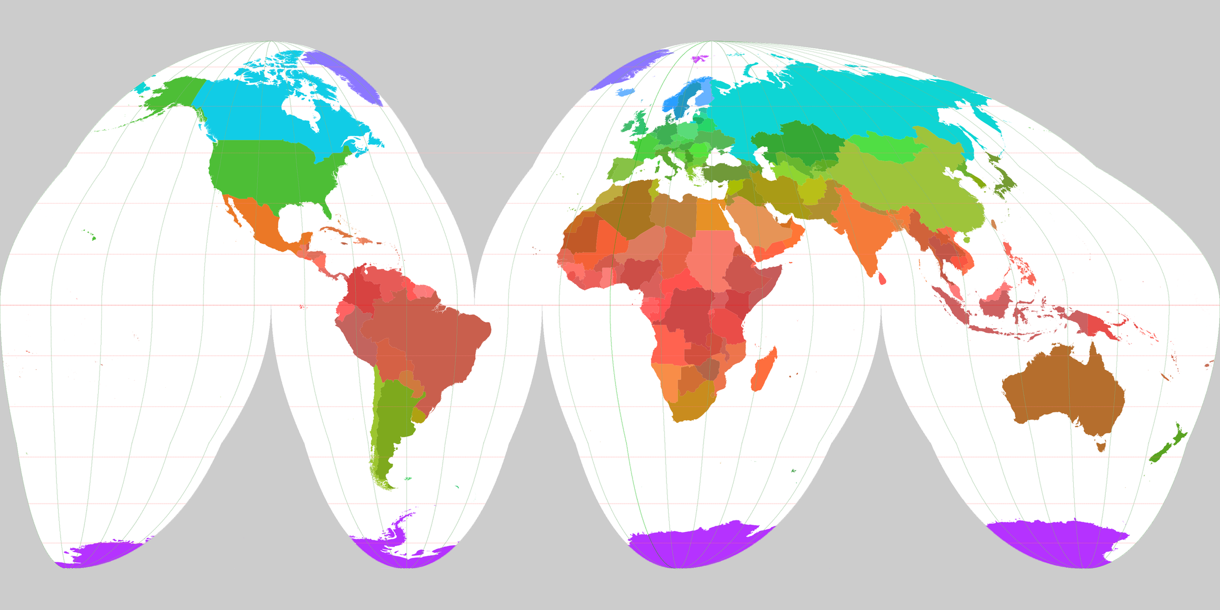
Gall-Peters Projection

In the 1970s a German socialist called Arno Peters started working on a map that wasn’t a reflection of hegemonic power, but a map that attempted to "regionalize" each area based on "geographic identity." Sizes of countries more accurately reflect their true size. The Peters World Map was later renamed the Gall-Peters projection because independently a similar map was created in the 19th century by Scottish clergyman James Gall. Boston schools have adopted the new map as the standard in their institutions.
Mollweide projection

The Mollweide projection is an equal-area map projection displaying the world in a form of an ellipse created first by Karl B. Mollweide in 1805. But like any map, the edges are still distorted.
The Goode homolosine projection
John Paul Goodes 1923 attempt at mapping the world, the Goode Homolosine, is commonly referred to as the ‘orange peel map’ because it shows a view of the world with gaps and tears, projecting the world as a peeled of surface.
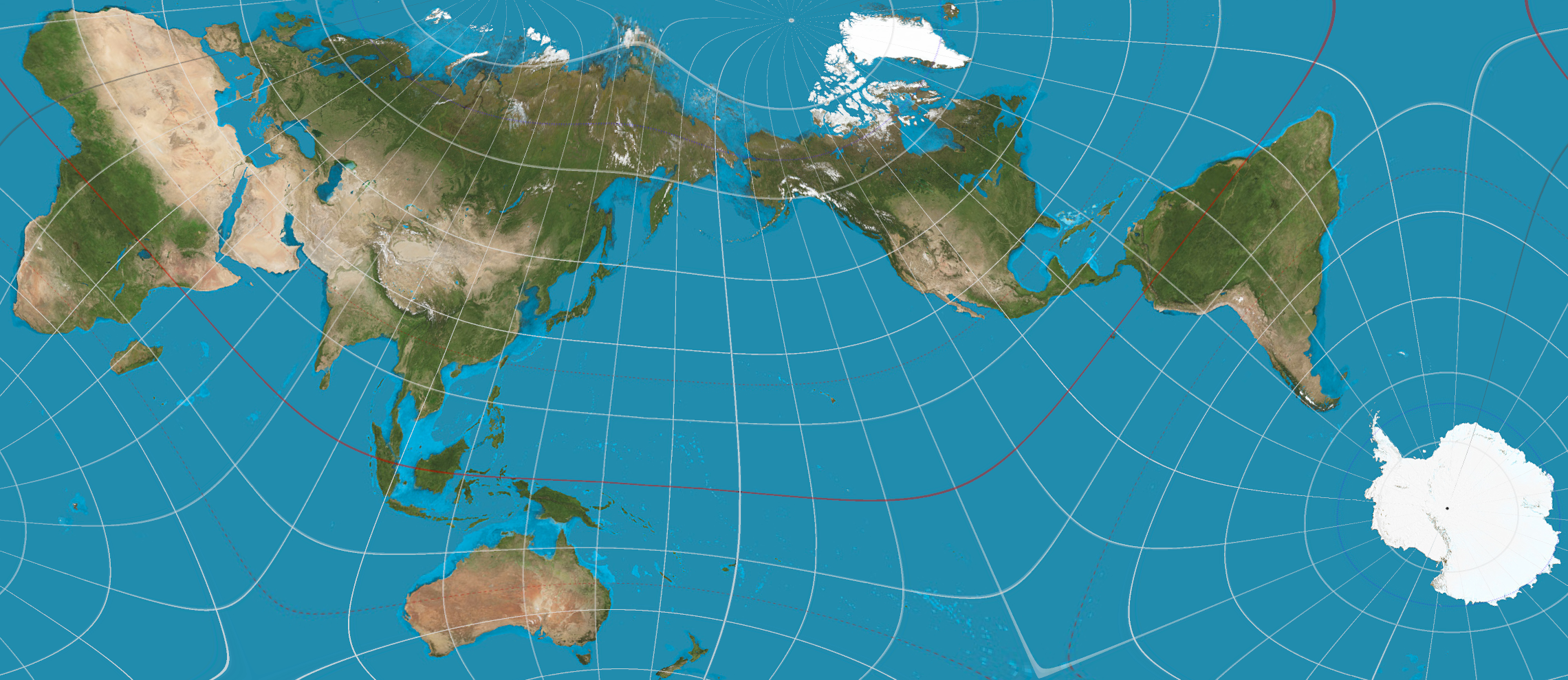
Dymaxion projection

The Dymaxion map, invented by American architect and inventor Buckminster Fuller in 1946 wasn’t so much meant as a practical map, but to show continuity in the world’s land masses. Fuller’s goal was to create a map that would not grossly distort countries’ relative sizes and shapes. On his map the Earth appears as one large land mass and according to Fuller was the best visual representation of what he called ‘Spaceship Earth’.
AuthaGraph Projection
The AuthaGraph Map was invented by Japanese architect Hajime Narukawa in 1999. The map projection tries to reflect an infinite perspective of the world. In this projection shapes and sizes of land masses are pretty accurate, with even less distortion than the Dymaxion map, but ocean areas are still jagged and distorted.
The final two maps do not intend to provide a more accurate projection of the world, but we included them because they challenge the Eurocentric worldview of the Mercator map and similar to the perviously discussed maps disrupt our mental image of the world.
True Size of Africa

Designer Kai Krause created the True Size of Africa map, showing how immensely large the continent really is. It was not an effort to create an accurate map of the world, as Krause states: ‘It was merely a simple graphical depiction of the statement: Africa is just immense - much, much larger than you or I thought. (..) And: here is to Africa achieving the stature that it deserves to have…’
The Topologists’s map of the world

Tom (first name only), a PhD student in astronomy created a map projection that shows how countries are connected. He calls it the Topologist’s World Map and it started with a list of countries, and on which other countries they border. The result, although it has some countries missing, is nonetheless an interesting mental map that reshapes how we relate to the world.